 |
 |
| By John Lester Copyright © 1998 |
|
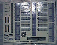
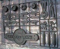
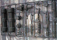
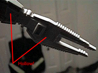
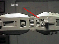
I've been waiting for this kit for ages. I'm not entirely sure the wait was worth it. Don't get me wrong - it's not a bad kit, not like some of the shapeless lumps of resin I've slaved over, trying to get something that looks like anything in the B5 universe when I finished. Heck, with less elbow grease than one would pour into an ERTL Enterprise-A one can have a nice little display model, maybe even a contest winner. I just wish it was bigger and more detailed. The kit comes packaged in the now-standard, flimsy clamshell box - which has at least twice the volume neccessary to hold it's contents. Two sprues of familiar R/M grey styrene are safely ensconced in a plastic bag. A largish decal sheet and 8 page instruction booklet round out the contents. Molding of the 37 parts is crisp and flash free (which is expected; it's a brand-new mold!). Detail consists of very fine raised lines and somewhat blurry "greeblies", which is really sufficient at this scale. The complex hull patterns are to be replicated by decals. At just under 17" the model scales out somewhere around 1/26,000 - close enough to AoG's B5 Wargaming Miniatures (capital ships). Those who complained ERTL's Enterprise-E kit was too small are not going to like this model. Those who hate R/M's thick, glossy decals will likewise hate the kit. On the plus side, parts fit is excellent - at least what I've seen of it (and I've already glued over half the parts together). You'll need little to no putty, and very little sanding. This one will be a fast build, perfect for a rainy afternoon. On the minus side:
|
      |
|
The bottom line: I'm disappointed this is not a better kit. For what it is (a model aimed at kids) it is fairly good though. With a little work, I can make this something I'm not ashamed to see on my shelf - and you can too. This is just our first look - we'll have a complete build up review of this kit soon. |
|
![]()
This page made possible by The Lester Press - copyright © 1997-8.
Last updated on 7 June 1998